Looking back at the websites made in the early days of the internet can cause cringes, just like looking back of photographs of yourself from decades ago. Both conjure up questions of “what were we thinking”. In the case of web design it’s less about mullets and more about the lack of “design” that went into the early websites of the 1990s.
Modern sites contain well laid out content that is functional, easy to navigate and easy on the eye too. This is thanks to the developments of the underlying technology of websites, such as HTML 5 and Cascading Style Sheets (CSS), faster internet connections, and more powerful computers, which have allowed for multimedia and images to be added to websites.
This improved mix of content can help cater for the different learning styles that people have. For example, some people learn better from visual stimulus, whilst others find it better to hear the information they’re taking it.
Make it Appropriately Engaging
The first step in deciding how you are going to display your data is to understand who your audience is, as this may significantly affect your decisions. For example, if you’re publishing findings of a piece of scientific research, to be read by other scientists, you may decide that a simple table is the most appropriate method. Conversely, if you are writing for a tabloid news publication that is reporting on the same piece of scientific research, a catchy title, graphs and other visual media may help to engage the readers and keep their attention.
It is best to also think about how you can simplify data, removing unnecessary elements that can distract from the important central message. Research tends to suggest that the more choices and information people have, the more confused they get. This is why many websites are now designed to funnel visitors in the direction that the owner wants them to go. For example, the checkout pages of Amazon’s website are plain, simple and free of options to look at new products. Instead, the pages provide you with only important information like delivery dates, your payment options, delivery addresses and the products in your basket.
Make Use of Colour
Using colors can help to differentiate your data in a single glance. They can be used in combination with many of the other techniques discussed here, but they are particularly useful with graphs and tables. Examples of using color include Odds-checker, who use four different colors in a table to allow their customers to quickly understand the different odds and how they are changing. Blue and red show odds that are shortening (improving) and drifting (worsening), while white shows the best odds. These colors help to show the changes in odds at a gal-lance without the need to know the exact numbers. This is particularly useful since the table has many rows. Similar systems are used on websites like Hargreaves & Landowner that show stocks and share prices, using green to demonstrate stocks that are increasing in value and red for those that are decreasing.
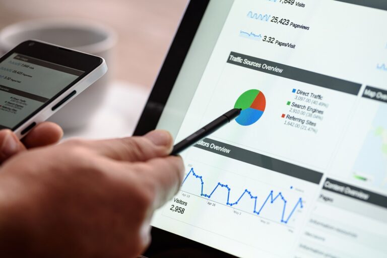
Make Use of Graphics
Graphics come in all shapes and sizes, whether it be a photograph, a drawing, or a graph. They can be used to display data on their own, or to compliment a table or a body of text. A popular tool used in online marketing is called an “info-graphic”. It’s definition has changed slightly in the online world, as it often refers to a large image that displays multiple pieces of data. Previously an “info-graphic” was any type of data visualization, encompassing maps, graphs and diagrams of networks.
You don’t need to be a wiz at graphic design to be able to produce professional looking info-graphics. Online tools such as Canvas help you to do it for free using their online info-graphic maker.
Graphics can help to make data easy to interpret in just a glance, without the need for the reader to study a body of text or a table closely. For example, this map shows the voting results in the 2008 US presidential election by using a combination of co-lour and size to show how many electoral college votes were cast and to which candidate.From this map, it is clear to see that Barack Obama received significantly more electoral college votes that his rival, John McCain.
Make Use of Videos
People are inherently lazy. For this reason, they prefer to watch videos than to read. You may have noticed a trend over the last few years where content published to social media sites has gradually transitioned from text to images, and then to video. This is because their research of user behavior has shown that people spend more time using their services when they watch videos than they do when reading. Research by Yowl in 2017 showed that 79% of consumers would rather watch a video than read when learning about a product.
Videos don’t have to be flashy though. They’re often of someone reading the text of an article aloud, with the occasion extra quip thrown in. Despite the time it takes to read the text and watch the video being the same, most consumers would prefer to let someone else do the work of reading. Examples of this include financial You Tubers like Jack Ch-apple and BeatTheBush who just stand or sit in front of a camera with a few props or a blackboard to help demonstrate what they’re talking about. The script they read would convey the same message if it was published as an article, but the video attracts a larger audience. Both of these YouTube channels have millions of views, demonstrating the success of using videos to communicate data.
In Summary
Data can be displayed on websites in a variety of ways. However, it is important to always ensure that it is engaging and relevant to the audience as it doesn’t matter how well presented data is if no one wants to read it. Whenever possible, a mix of methods should be used to create a balance for all of the different learning styles to reach a wider audience. The use of graphics and color can help to make data easy to interpret quickly and easily, whilst using videos can use these methods whilst reaching a greater audience.